| When it comes to the occult art of textile attribution, I'm just going to come right out and admit my conclusions are based almost entirely on very remote supposition and dodgy logic. If I've said that before, it bears repeating in case it sounds like I know what I'm talking about. My only claim to distinction in the field is an eye for a half-decent thing, generally speaking, and a fairly retentive/associative brain. |
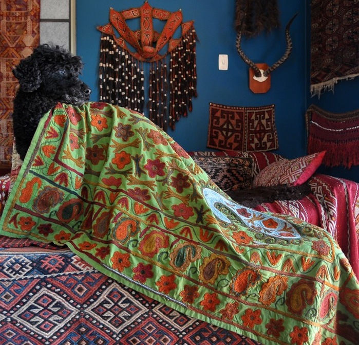
| What's not to like isn't something you can say too often about the general run of suzanis. They are an acquired taste- often loud, chaotic, lopsided, alien, violent... in fact, everything that might challenge the comfy urbanised eye, so it's rare to find a piece from this tradition that doesn't assault or appal you in some way. We like visual assaults and our house is full of them; this blanket is a nice reprieve. I think this is of Lakai or Kungirat origin, from a comparison with other pieces, but like most of what you're about to read that's not set in stone. The late 20th century signalled the end of many of the transhumant lifestyles and value systems that conceived these striking embroideries which had anyway been degraded by commercial imperatives. Suzanis were once dowery and prestige items, painstakingly assembled from handspun, organically-dyed fibres- silk, cotton and wool- by and for family members and bearing culturally relevant symbolism. The endless steppes and monochromatic winters of Central Asia must have rendered these repositories of colour and comfort an incredible contrastive richesse. |
I'm not an age-snob, though, and don't accept the generally-held view that older equals better, more valuable and more artistically worthy. There's plenty of shitty tat floating around with little but age and patrician provenance to recommend it. Agnostic curiosity fuels my interest in the history of the modest objects we collect.
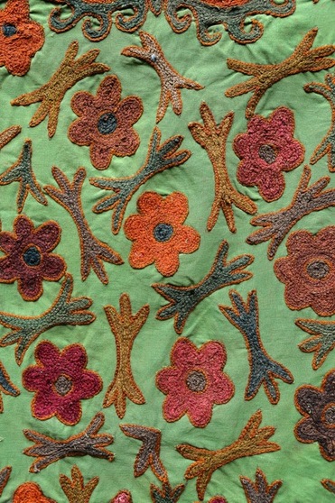
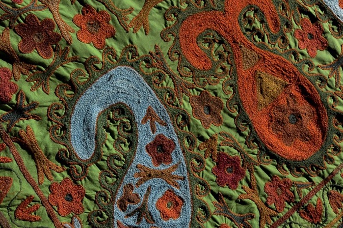
Most of the dyes appear to be organically-derived and I say that for two reasons. They exhibit the wandering variation called abrash, from the Persian 'mottled', and that's the first thing out the window when commercial dyes are in play. Also, these shades are relatively easily achieved by tweaking a handful of humble dyestuffs. They aren't the insane clown posse colours- the Cadbury purple, sizzling lipstick red and Travolta black- that are the usual aim of synthetics. The orange is perhaps suspect, but it's not as hot and solid in life as it appears in some of these pics. Would a Central Asian lady really have reached for the Dylon to achieve a perversely naturalistic palette? It's a bit counterintuitive.
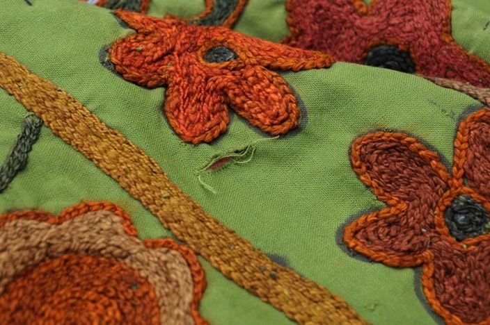
The embroidery is suffocatingly dense rather than loosely indifferent, nor are there the usual expanses of expedient plain stitch seen on commercially-intended pieces. If these are natural dyes, then this all-over chain stitch suggests an earlier date along with the absence of any machine sewing and artificial materials (as far as I can tell).
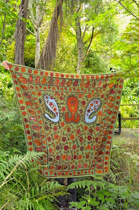
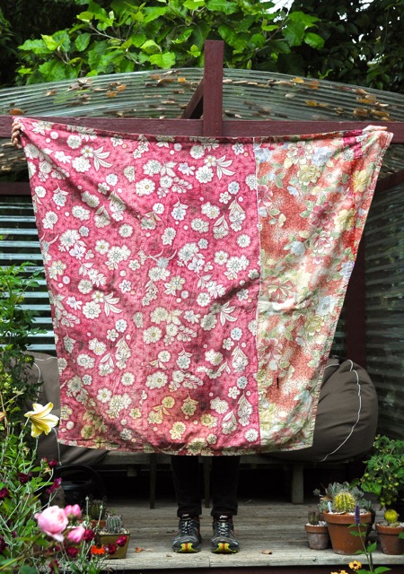
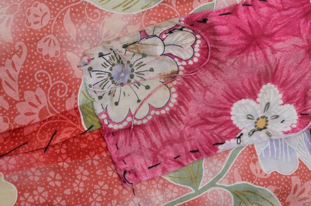
| The fact that it's a horse cover in parochial taste also bolsters the idea that it was not made explicitly for sale and could therefore be older. The floral backing prints are Chinese circa 1960, retain a bit of horse-grease and have been patched, which points to sustained use; these are replaced as they wear out on favoured older items, but these ones may be perfectly original and contemporaneous with this piece. The green base is in good nick with one or two usage whoopsies. It doesn't have that battered, threadbare look of truly antique cotton, nor does it possess the tight, polished regularity of modern production, so... first half of the 20th C? |
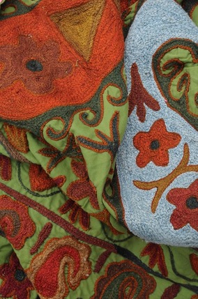
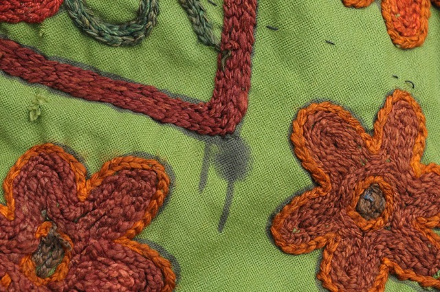
| The designs are first sketched out on the base cloth, traditionally by a knowledgeable senior woman in consultation with the prospective embroider/s and according to the intended purpose. You can see the underdrawing in the images directly above and left. It looks like ink applied with a brush rather than marker pen, so I'm going to assume that weighs in favour of age. Let's consider iconography. Academics are still losing buttplugs and choking each other out over the origins of the paisley or boteh motif so I'll leave that one alone. |
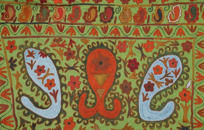
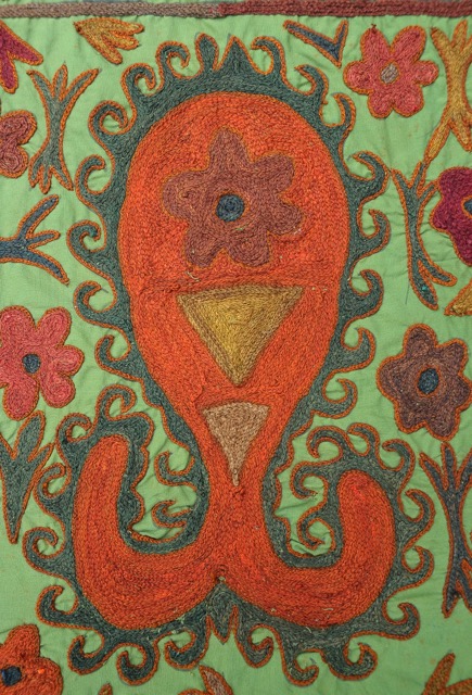
| That central mutant double-tailed boteh supposedly incorporates aspects of the scorpion and ram's horns (protection from misfortune and strength, respectively); the triangles are abstract talismanic elements. I think we all understand the flowers. These paisley + millefleurs compositions always remind me of Mughal designs. Those northern Indian aesthetes shared a love of embroidery with the suzani tribals and their refined idiom was butched up on the steppes, the local ancient totemic symbols settling into these formal, symmetrical arrangements. |
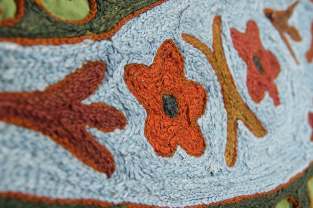
| More or less symmetrical, because you can rely on a suzani to bring the random and confound Western expectations of tidy resolution. See the first image and note the single blue boteh in the border, then the little blue motif to the right in the above pic. Guaranteed 100% effective against evil eye. This particular composition implies the artist knew how to pimp a horse in accordance with the expectations of an extant tradition, and understood the talismanic significance of these devices rather than just throwing them around in a decorative manner. This piece looks coherent, and therefore older. Most modern suzanis are essentially joyous visual gobbledegook- pastiches full of obvious appropriation. On the other hand, the spacing of these elements is slightly funky and inelegant, which can imply modernity. Unhelpfully, wild drawing is also a feature of some very old work and some groups are renowned for their punk stylings, especially- you guessed it- the Lakai and Kungirat. Doh. Both groups are noted horse fanatics; the double-boteh symbol is generally attributed to the Lakai but those guys really love red and it's weird to find something of theirs without it. |
Is that crazy? You tell me. EDIT after reading this piece I am inclined to this this is a daur blanket for embellishing the Kungrat bride's ride to her husband's family. Cool.

 RSS Feed
