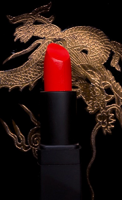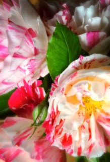
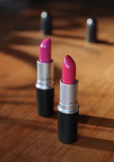
L: Girl About Town R: Full Fuchsia
I snatched the thing up and swept out like a dramatic bitch. But after plastering it on in the car on the way home, I looked in the rear view mirror and turned that frown upside down; rather than making me look like an incompetent and/or murderous transvestite, GAT slapped me with a dose of very slightly blue-leaning My Little Pony bubblegum pink that was not so much violently objectionable as unexpectedly flattering. Which is probably why it's one of the superstars in MAC's permanent range. RIGHT: L- GAT, R- FF. 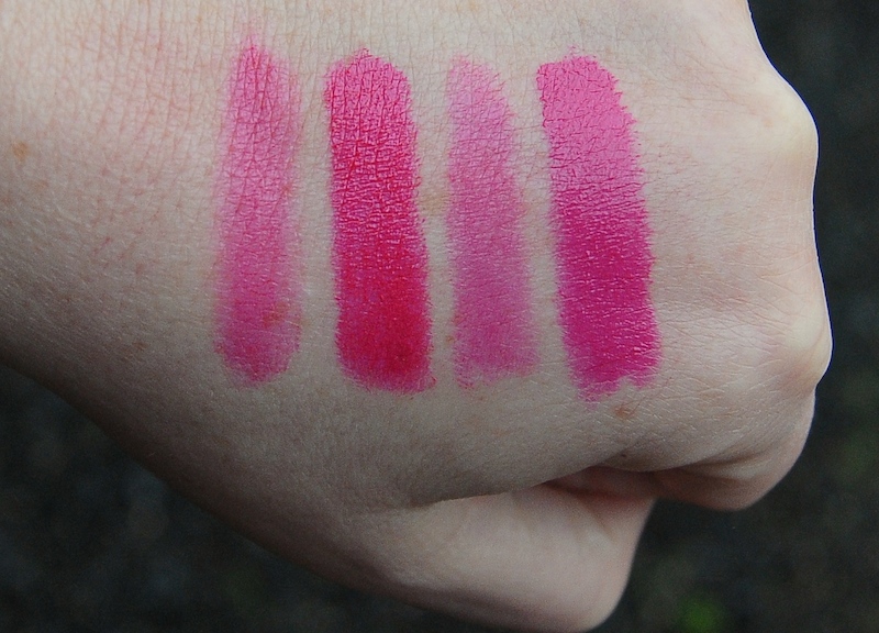
| Define fuchsia. Um, sort of pink? With a bit of red. But not red red. Sort of more like... pink. You know... like the flower. I could go on. Let's settle this right now; having stared at a lot of pinks and fuchsias in the course of composing this review, its my opinion that fuchsia is generally warmer than pink, despite its varying degrees of red and blue, and that this really is the most meaningful differential. We'll talk Girl About Town (Amplified) first. GAT began my (admittedly pretty narrow) dalliance with true pink. I picked it up on a whim while B2M'ing; here in NZ we're only allowed to choose between about ten of the most popular MAC shades when scoring freebies, most of them glutinous Kardashian nudes (ew). Yes, that is annoying. The local counter was all out of Ruby Woo, leaving GAT and not much else. 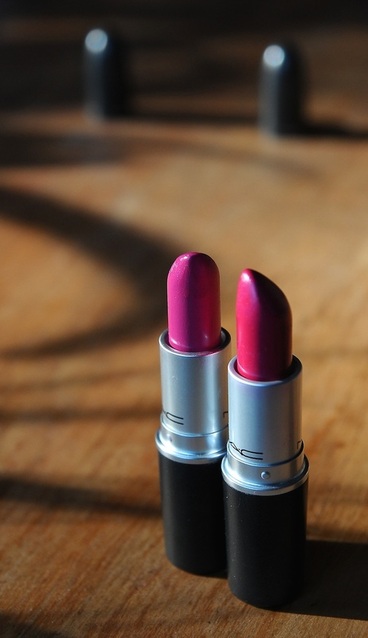
|
ABOVE LEFT Full Fuchsia sheered out, then @ max. thickness; Girl About Town / same deal.
(The swatch above 'blows out' on a laptop screen unless it's angled correctly.) I can't really fault Girl About Town's amplified formula, and yes, I know I've been banging on about it for a while now but I'm a dyed-in-the-wool matte whore so forgive my recent-convert's zeal. The pigmentation is super smooth; there's no bleeding, only a very slight settling into creases and no mid-lip loss for around 4 hours. It mixes well with a range of Retro Matte pinks, making them more texturally bearable. With everything going for it, I will say that maybe anyone over 30 should consider their whole look and ask themselves if they haven't aged out of pinks like this. Brunettes can possibly rock it for a few years longer than blondes, unless you have a look that is complemented rather than sabotaged by this sort of high-contrast goodness.
Okay, Full Fuchsia. I hear a sort of high-pitched simian chattering in my head when I think of this shade; that's probably because wearing it can make me look like a baboon's bumcheeks. FF is a brilliant true fuchsia delivered in divine amplified form, but it's also a first cousin to MAC Show Orchid and a second to Violetta, those other lipstick no-nos that look like arse when applied to a particular kind of pasty physiognomy (ie. mine). Arse, I tell you. It's the microglitter and slick mauve-blue sheen lurking over the foundation shade that makes all three dodgy prospects to one degree or another. These characteristics aren't very visible in these pics, but trust me, they're present in life. Full Fuchsia is the least garish of the afterforementioned trio by quite a way, and nowhere near as disastrous on the wrong mouth as the dread Violetta. If you can rock vivid and sparkly you'll enjoy everything it offers the right face- luminous colour, staying power and a versatile 90% opacity. Just keep in mind that the slight duotone lustre and visible glitter might clash with dark lips and a fourth decade. Teh. I wear it anyway.
The swatch below is warm, unflashed daylight; the two shades in question rendered really well because the yellow-toned light has helped the camera sensor out.
The swatch below is warm, unflashed daylight; the two shades in question rendered really well because the yellow-toned light has helped the camera sensor out.
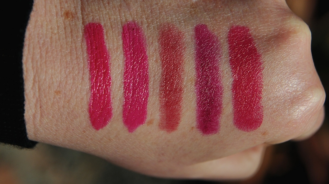
L 2 R: Full Fuchsia, Girl About Town, Hot Tahiti, Rebel (All MAC), Urban Decay Catfight.
 RSS Feed