 | Don't you hate it when the exact colour you're looking for in a certain bracket is in fact the last one you buy? How many effing neutrals did I have to tear through in order to find the one I really needed? Anyway, here 'tis; MAC Retro, the most broadly flattering and balanced of all the darker neutral shades I've tried in the last year or so *trumpets sound*. If you've never wandered into this sort of lipstick territory for fear of those horrific mouthlessness, trophy ho or durrface syndromes, you've gathered enough clues in your time on earth to recognise and attempt to avoid those conditions. You probably already know the dangers of which I speak- general dullness; pointless, unnatural tonalities; poor texture etc etc. There's no reason why someone like me should have trouble finding a decent neutral. I'm pale. Okay lips and skin. No whacky undertones. Plain blackity-black hair. Dark green/hazel eyes. I should be rolling in a massive swag of compatible possibilities but jesus, so many were muddy, ashy, unflattering, nasty and just flat-out unwearable. |
You could blame the clear light down here in New Zealand, because it's generally free of the yellow/brown/dishwatery tones imposed by the pollution and the harsher seasonality of the northern hemisphere. On the bright side, our light lets reds and browns and jewel tones be great; on the doh side, it's super-hard on these muddled-earth neutrals, ruthlessly exposing any fails in their compositions. That doesn't absolve manufacturers from pulling finger and trying a bit harder. We're not all yellow-toned bronzer addicts.
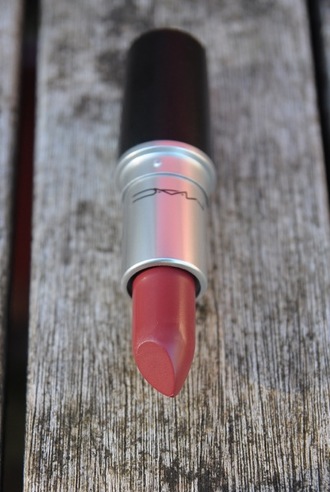
| Anyway, back to MAC Retro. It's got a lengthy pedigree and there's a number of very good reasons for that. The shade itself is a delicious warmish mélange of creamy rose, medium milk chocolate and a back-seat dusting of ochre. This toffee tone soaks right through everything else and knocks out any possibility of ashiness, so if you tend to pull everything grey and cool, consider Retro; it is very resistant to that phenomena. | 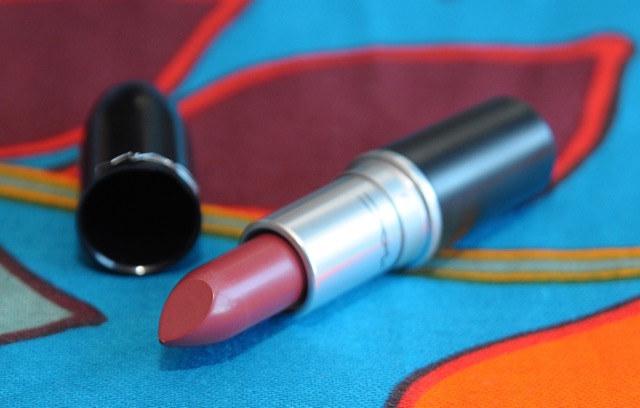 |
It is warmer and far kinder than the recent MAC Whirl matte and is probably what I was hoping MAC Pander Me would turn out to be. Look at the daylight swatches below; I'm trying to think of someone who wouldn't benefit from Retro and drawing a complete blank, regardless of complexion; there's something in it for everyone.
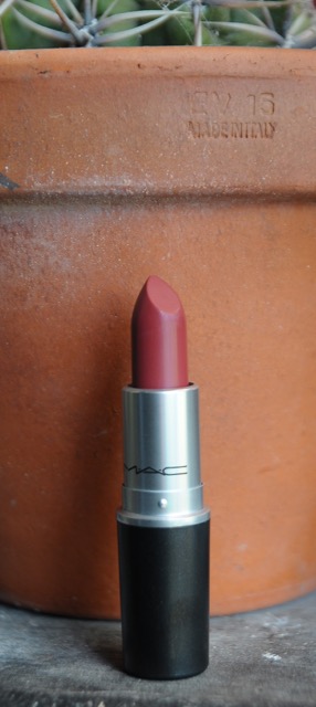 | 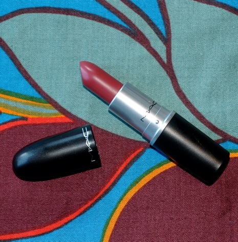 The formula is one of those very tenacious, thickly-pigmented satins that is stable and muted without ever drying down to total matte, so you keep the benefit of a slightly plumping sheen. I get four hours of careless wear before touchups are required, and don't find it drying. No feathering, no staining; all good. Retro gets original gangster status, answers all my not-red lipstick prayers and that, fellow cosmetic fans, is a relief. |
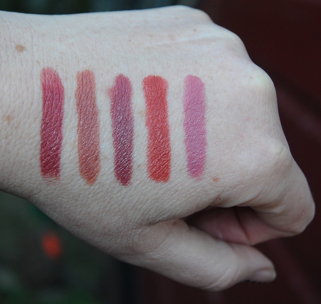 | 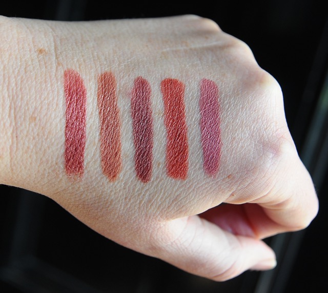 |
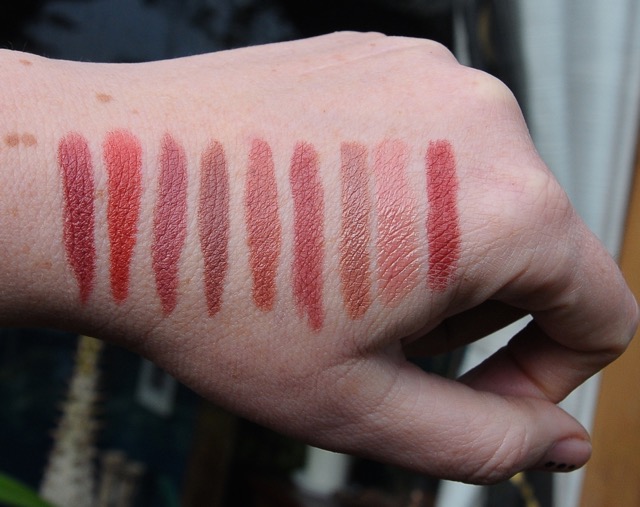
L2R MAC Retro, Taupe, Del Rio, Chili, Mehr
in a range of natural outdoor lighting. Retro is reading maybe 5-10% pinker than it does on the lip here, which may be the slightly blue winter light cancelling some of the warmer, earthier tones.
in a range of natural outdoor lighting. Retro is reading maybe 5-10% pinker than it does on the lip here, which may be the slightly blue winter light cancelling some of the warmer, earthier tones.
Neutrals & Contouring & Shit Like That: a Skeptic's POV
What a fucking drama finding a daytime shade that didn't make me look like something heaved up out of a landfill. Why are there so many utterly horrific neutrals? My main complaint is this- 70% of them are too pale for the one damn job they're supposed to do- i.e. subtly referring to and complimenting your mouth without contributing too much to your overall composition, whatever that may be. To my eye, people generally wear neutrals that are far too light in the belief they are reducing the visual impact of their lips, which is crazy. A pasty greige bow-tie shape where a mouth should be is the very definition of WTF eye-catching.
For those of you still struggling to find an everyday MLBB trick because they all look freaky on the face, I've found neutral lipstick works best when we match it not so much to the specific colours in our complexions, but the general level of contrast situated therein. As I've already stated, I'm pale with black hair, medium-dark eyes and dark lips, which is a high-contrast look. A tanned sandy blonde with pale eyes or a dark-skinned brunette? They're both low contrast situations and those guys can get away with softer shades that melt into the rest of them. The lighter peachy neutrals look like anaemic hell on me, because they don't roll with the pronounced degree of difference on the rest of my face; it may seem counterintuitive, but if there's plenty of contrast between your hair, skin and eye colour, go for a stronger, bolder neutral.
I had to work through a metric tonne of emulsified beige to come up with that wisdom so give the principle a try.
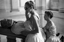
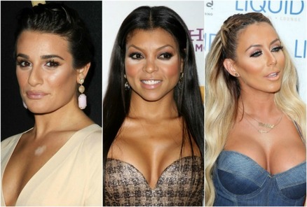 | < This public service announcement is brought to you by the letters Oh honey, no. If this applies to you, please consider it a lovingly-intended intervention. Take a good look to the left there. Forget the tupperware titties and non-ironic nose jobs, just for a moment. What do they have in common? They all thought they looked dope in the bathroom. |

Lip liner contouring- no. Contouring per se- no.
Unless you have the world's lightest hand, magic universal lighting and fine art training.
I do have fine art training and don't consider myself qualified to contour. In my humble opinion, attempting to alter perspective with the skill set most people possess is a thing doomed to unsightly, stripy failure. I cannot be the only one seeing far too much troweled-on trompe-l'oeil-horror every time I venture out in public. That shit is epidemic.
It's all about relativity and context. Contouring is a child of the stage, the runway and the studio, their common denominators being distance between subject and observer, and extreme lighting. Distance. Extreme lighting. Those things don't apply in IRL. With everyday contouring, you are essentially superimposing changes that have little/no relevance to A: your features or B: your context, so you just end up looking you-tried-it cubist for no reason. I mean, you can always just keep going with that shit and extend it to other parts of your body, and then... well... if you really want to see how that works out sans remedial software, there's always Youtube tutorials. Or the Daily Mail. Friends don't let friends look like a fucking demoiselle d'Avignon >.
 There's a feminist POV, too. Mainstream contouring is overly concerned with the negation of the personal and bullshit pandering to a gross paedomorphic aesthetic. As an old goth and veteran drag appreciator, I'm as fond of the heavy hand as the next bitch. My glamour situation used to start and finish bar fights, but that shit is about creatively subverting a retarded, oppressive ideal, not lining up to outdo the fucking thing, jesus. | Here's the cruel-but-fair 411 from a disinterested party- if you can't draw a recognisable, fully-shaded human face, on a page from scratch, you probably don't have the ability to constructively edit your features with a contouring quad. I mean, how many really successful blush applications have you ever seen in your damn life? And that's just one tonal unit, dammit. 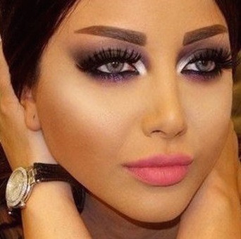 |
Contouring and all the other applied-art fails that ride in its slipstream are to makeup what Michael Bay is to cinema and all that angers and depresses me. That face above right is just something I plucked from a disturbing wall of Google that nearly murdered my will to live. And posed so many questions. Why is it all car paint, melty post-mortem Barbie and ocherous five o'clock shadow? Why does everyone look like they'd bounce off a hardwood floor? Should lashes be able to sense an enemy's fear? Why Futurist chocolate protractor brow? What does it mean when the inner corner highlights defy the surrounding smoky event-horizon and actually move your eyes closer together? And why, after three litres of whatever that is should we still go ahead and dump a bucket of smoothing filters on it? Why do I smell burning hair?
You could call it garden-variety bad taste or harmless aspiration. But I don't think it is harmless. This ideal just happens to agree with the expectations of tools who don't really like women- male and female, but is that really a surprise? When we are exposed to more human diversity than ever before, it makes perfect sense that those threatened by freedom of contrastive expression would take refuge in shifting the goalposts; in promoting or conforming to a new autocratic standard. Cue an avalanche of neotenous, denatured pleaser dolls.
If your makeup is making you look like something with an onboard control panel, it's time to reconsider your choices. And to take responsibility for the messages you're sending. The colour of our eyes should never be more important than their expression. Basic organic shit like the shape of our faces and features are the result of thousands of ancestral generations. They deserve respect. They help make us what we are, and their diversity is a blessing. Get the fuck out of here with your tiny, tiny noses and your pleeease looove meeee mutilation-edits. Chins don't need to be smaller and cheekbones don't need to be higher. Nobody needs an arbitrary industrial catface to leave the house and go about their business, be it surgical or self-applied. Let available light and physical reality do its work. Or at least back the applied shit up 80%.
The only people admiring your new crayola cheekbones are pre-Lasic or groggily post-operative.
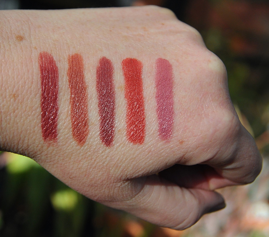
As a final flourish, here's some more comprehensive swatches of the neutral and neutral-esque lipsticks still in my collection, although I'm about to offload a couple (guess which ones). You may not think of them as specifically neutral, but on my personal scale they're not colourful enough to be anything else.
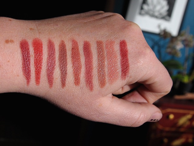 | Left to right. MAC Retro MAC Chili MAC Riri Bad Girl (LE) MAC Whirl MAC Taupe Nars Walkyrie Bite Honeyberry MAC Bare Again MAC Auburn lip pencil Warm indoor sunlight, and below is cool outdoor winter sunlight. I do not use flash. |
 RSS Feed