 =) |  : -/ |  : -I |
It's probably safe to assume that not everyone has subjected themselves to the process of designing and producing a book cover. Some of you might be interested in having a little peep behind those images that eventually stare at you from atop that endless pile of words. I mean... why did they choose that horrible thing? Why wasn't it pink? Why go representational when snappy reductionist graphics and retro type are so now? Why that nasty font? Why is your name so teeny? All perfectly good questions.
Putting together a cover made me feel seventeen all over again. Everything sucked; all my ideas were just too sophisticated, oblique and original for an ununderstanding world etc etc. Or like alujha just before the full moon: hostile, itchy, suspicious, sweaty. Even more so than usual. Being a sometime-artist as well as a writer, I thought I'd enjoy it, but how wrong I was. There are seven basic stepping stones into this creative Naraka.
1- Vacancy. Self descriptive, really. That Nothing that's always dogging the need for Something.
2- Conflict. Conflict with your editor/partner/copilot/everyone about exactly which genre you've been writing for the last ten years. Always a pleasure.
3- Concept. You've got it; it's perfect and it was so easy. You pity the fool denied access to the kind of high-carat genius dripping from every orifice of your creative unconscious.
4- Execution. When you're hardcore like me, you don't train for or read up about anything because that shit is for suckas. Instead you front-load with notions of your own spontaneous omniability then take your hand off it just long enough to fire up PhoSho. That distant boom is the sound barrier falling to the speed of your first technical faceplant as you realise you don't really know how to get a raw dufus shot to look... I don't know... expensive. Like someone paid somebody for it, basically.
5- Revelation. No more hovering over the screen like a pterosaur, snarling it's not ready. It's done. Behold.
6- More Conflict. Nobody loves your baby. Philistines squint at it, it's damned with faint praise, greeted with puzzled silence, someone thinks it's an ad for a handbag night at a gay bar, someone else giggles without realizing just how close to death they've come in doing so at this juncture. The drawing board- you're back to that bitch.
7- Screaming Into the Void. Maybe you don't know how to do this after all. You spit on Adobe and all its descendants. Why do you even need a fucking cover? The audience is the enemy of genius! Where did you leave that three year old roach? Why has no one activated my Echelon package?
Repeat steps 1-7 10-15 times. I'm not joking about that.
Before going any further, I should confess that although I approached this process from a position of operant naivety, I have leisure, free access to a proficient photographer, middlebrow software and five or six years of hissing obscenities at the screen in the pursuit of basic competence. I thought all this would be an advantage, and to some extent it was; I didn't have to pay for anything you see here and was at leisure to tweak until the cows came home. To alter, amend, redact, invert, defocus... increase pro contrast... gaussian blur... decrease pro contrast... and therein lies the rub. I could, and so I did. Ad nauseum. Big mistake.
R F T B
I floundered for a long time, trying to get to grips with what the hell I was supposed to be doing. You know- artist stuff. Angst, insecurity, overconfidence... and then it struck me, the kind of blinding cthonic revelation so horribly transfigured by tardiness that it's more like chewing fishguts than experiencing the divine- the image is not about you. It just has to be right for the book- RFTB.
It took me so long to accept impersonality as part of the Way in this instance because I am a controlling perfectionist freak who can't let go. I was just lucky I could dig myself out with the skills I had to hand and wasn't paying other people to do so. Very lucky. If you are putting the image together yourself and you're happy with your technical ability to do so, here's what someone should have told me right from the start; try keeping The Personage Currently Known as The Artist in your pants, dial back the desire to infuse it with your own godlike pneuma and remember the need to inform as well as astound your potential audience. In short, keep it RFTB. In fact, my advice to any übercontroller struggling with the process is this- don't aspirate as much mud as I did; letting go is not the end of the world. Consider finding an art student and giving them a solid brief because a disinterested pair of eyes is sometimes the only thing for it.
T A S T E
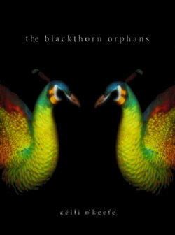
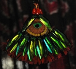
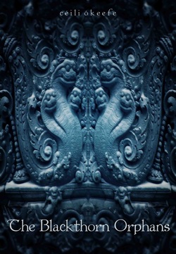
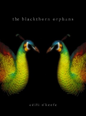
A cover is important, but only on one level. In the end it doesn't matter that you've gone mad with cyan or punched the black too hard or signed off on the last draft of that prophet-fellating-a-donkey litho triptych. More than content, it's the taste level we're subconsciously assessing when we're scanning those glowing thumbnails looking for something to read. What those shapes and colours say about the level you're operating on. Here I personally came to another fork in the road. The Blackthorn Orphans is a conflicted thing; on one hand it's bulging with questionable taste; the humour is black and the players are dirty boys and girls (and things). On the other hand, it aspires to a certain standard of literacy and serious business does lurk within its (soiled) fabric. I needed to strike a balance between the high+low-brow elements; an implicit balance, preferably. That isn't easy, visually. Fortunately I'd figured out what I wanted by this (very late) point, and I strongly recommend making that your first step. I wanted mystique, some sort of fraternal allusion, disguise, beauty, biology, mythology... and I do think the peacocks get there. They're not precious or pretentious but nor are they busty mutant she-creatures mounted astride some sort of heaving whatever. We still enjoy the image, which is a good sign, and it's gotten passed around quite a bit. What else can you ask for?
You might have guessed by now that it wasn't my first choice and that I fucked about endlessly. Bingo. With the book being so extra-genre-tastic I didn't know where to start. Until I came across a tiny piece of frieze from Kathmandu and thought all my xmases had come at once.
I floundered for a long time, trying to get to grips with what the hell I was supposed to be doing. You know- artist stuff. Angst, insecurity, overconfidence... and then it struck me, the kind of blinding cthonic revelation so horribly transfigured by tardiness that it's more like chewing fishguts than experiencing the divine- the image is not about you. It just has to be right for the book- RFTB.
It took me so long to accept impersonality as part of the Way in this instance because I am a controlling perfectionist freak who can't let go. I was just lucky I could dig myself out with the skills I had to hand and wasn't paying other people to do so. Very lucky. If you are putting the image together yourself and you're happy with your technical ability to do so, here's what someone should have told me right from the start; try keeping The Personage Currently Known as The Artist in your pants, dial back the desire to infuse it with your own godlike pneuma and remember the need to inform as well as astound your potential audience. In short, keep it RFTB. In fact, my advice to any übercontroller struggling with the process is this- don't aspirate as much mud as I did; letting go is not the end of the world. Consider finding an art student and giving them a solid brief because a disinterested pair of eyes is sometimes the only thing for it.
T A S T E
A cover is important, but only on one level. In the end it doesn't matter that you've gone mad with cyan or punched the black too hard or signed off on the last draft of that prophet-fellating-a-donkey litho triptych. More than content, it's the taste level we're subconsciously assessing when we're scanning those glowing thumbnails looking for something to read. What those shapes and colours say about the level you're operating on. Here I personally came to another fork in the road. The Blackthorn Orphans is a conflicted thing; on one hand it's bulging with questionable taste; the humour is black and the players are dirty boys and girls (and things). On the other hand, it aspires to a certain standard of literacy and serious business does lurk within its (soiled) fabric. I needed to strike a balance between the high+low-brow elements; an implicit balance, preferably. That isn't easy, visually. Fortunately I'd figured out what I wanted by this (very late) point, and I strongly recommend making that your first step. I wanted mystique, some sort of fraternal allusion, disguise, beauty, biology, mythology... and I do think the peacocks get there. They're not precious or pretentious but nor are they busty mutant she-creatures mounted astride some sort of heaving whatever. We still enjoy the image, which is a good sign, and it's gotten passed around quite a bit. What else can you ask for?
You might have guessed by now that it wasn't my first choice and that I fucked about endlessly. Bingo. With the book being so extra-genre-tastic I didn't know where to start. Until I came across a tiny piece of frieze from Kathmandu and thought all my xmases had come at once.
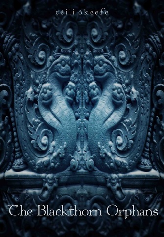
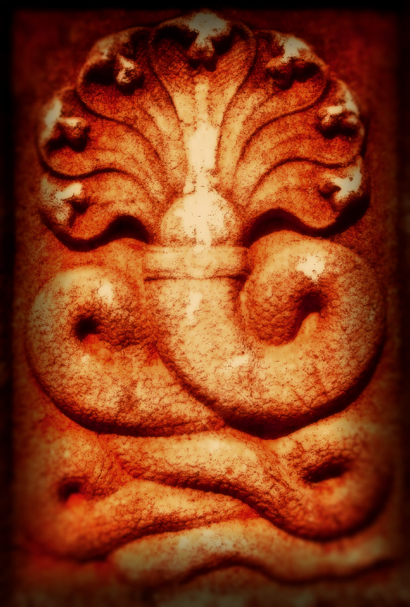
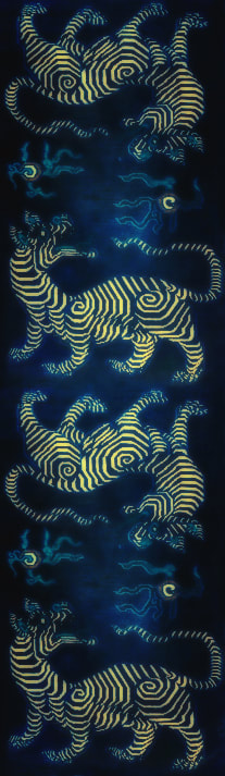
C O V E R I - T H E N A G A S
Only a small portion of this image exists in reality and I built it from there, mirroring and extrapolating. I've always loved the Hindu/Buddhist Naga for their ambiguity and because of my longstanding fondness for serpentes in general; I named my worst witches after them and Sachiin and Kala'amatya don't really mind being called snakefaced bastards. Is it a doorway? A temple? A murti? What? To my mind it does a good job of attracting the peeps that I write for and visually macing the ones I don't.
The difficulty was integrating the font with the intricacies of the image and what a bitch that turned out to be. That's another thing every DIYer should know straight up; the less expertise you have, the more you should consider a vacant background to any ABCs you plan to feature. Do try and work the text, too, or you'll end up with generic on toast. Rasterize, customize. I think we eventually settled on Caluna, though it tended to change daily, and this version is Colwell, now my favourite by a long shot. I literally had 20 fonts on the go at once, everything from Kelvinized to Porcelain. They still haunt my dreams. I love this image with every black fibre of my being, but it was eventually rejected (by everyone else) for being too 'horror'. Pussies!
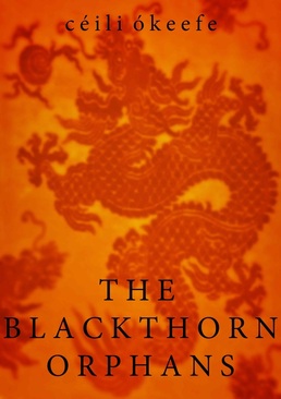
C O V E R II - T A N G E R I N E D R A G O N
After the Nagas got notice to quit I was in a bit of a panic and thought I'd better go more mainstream. Hey- dragons; Eastern, elemental, symbolic of longevity and everyone knows what the hell they are, which I'm told is important.
It's not as though I detest this cover and it's by far the most commercial, offending no one, avoiding fantasy's most heinous cliches, engaging the timid, and I'm sure if it showed up in Amazon's top 100 people would be clicking the everliving shit out of it. I might even test this theory by using it promotionally. But in the end... I just couldn't. This is a fucking bookclub cover; it would have sat quite happily on that screen behind Oprah's big stupid head and that is a fatal mutation. Say what you like about TBO; a bookclub read it is not. Back to the loch with you, Nessie.
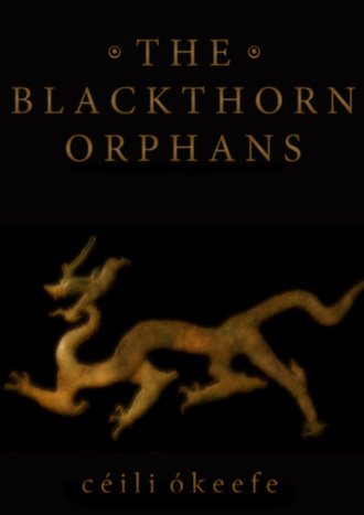
C O V E R III - B R O N Z Y D R A G O N
I really thought I'd nailed it with this image. After faffing around with fonts so long I'd started to look sans serif I was pleased to have settled on something legible and possessing a modicum of dignity. I'm not in love with it now (the fade on my name gives me cat's-bum-face as we speak) but at the time it was the shiz and I slept well.
Then the demons of doubt swooped down from Tresul or whever the hell they live and started biting my arse. The beast in its original form was lifted from an aherrmm herm herm, (I know, I know) and though it's unrecognizable now (and therefore probably perfectly legal), there's still that lingering whiff of copyright brimstone. Also, is there something YA about it or is that just me? In the end this one was binned, but not without regret. I may resurrect the dragon for the next book; it is so sinuous and archaic and I think contemporaneous with my oldest characters. I like that association.
T H U M B N A I L S A R G H H H . . .
The other thing I should have considered from the get-go was the actual dimensions to which my image would be reduced, by and large. Yes, doh. Another conundrum; which is more important- thumbnail or full size? Because most graphics will look like arse on at least one end of that scale. See below.
 |  |  |  |
Bronzy dragon fares worst here, another reason why he didn't make it. Tangerine dragon is humping your eyes like a thirsty diva and that's sort of great, but not what I wanted. The Nagas start looking a bit sci-fi, a bit too off-topic and wtf. But the peacocks hang onto their luminous symmetry, neither shrieking at you nor disappointing upon further examination (IMHO). I'll also stick my neck out and say font legibility is pretty redundant at these dimensions so don't throw composition under the bus just so you can read the title at teeny xs microscopic; everything your reader needs to know is in the text block alongside. Part of me wanted to abandon it altogether because of this, and I wonder if the in situ title is a convention that will endure online.
These images are less than a third of the also-rans I generated over the course of a few months. But being congenitally resistant to instruction and procedurally myopic made my way the hard way; yours needn't be. DIY is obviously the first choice of the remotely able, if not the only one. Put a leash on The Artist; try to treat it like a cash job, pull back often, be as critical as you would of some other poor shite's work and keep it RFTB.
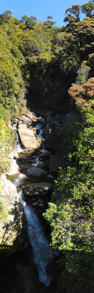
If you're artistically declined, don't despair; you can still communicate your taste and ideas with something as simple as an unretouched photograph. Hit up filmic acquaintances for their work or go for a stock pic; online libraries are suffocating under the weight of excellent, accessible photography of every description. Get on to Flickr and Tumblr and ask some of the many talented peeps there if they would let you use their images; you'll get some hell no's and demands for the money everyone believes everyone else is making, but you'll also strike plenty who'll be happy to help for next to or literally nothing. Just be honest in your dealings with potential collaborators and know your rights and obligations around licensing and ownership. If you choose to go with a pro, you're possibly doing the smart thing. Sight your conceptual objectives directly. Learn to clearly delineate your ideas and desires to anyone you commission; this alone can be more difficult than you expected. If you can't effectively explain them to your partner or your mother or that hunk behind the counter at the bookshop, you need to try harder because failure can quickly become painful and expensive. Above all, we should have enough respect for our own efforts to at least try and get them the cover they deserve. Keep reminding yourself that it's easier than writing the darn thing in the first place.
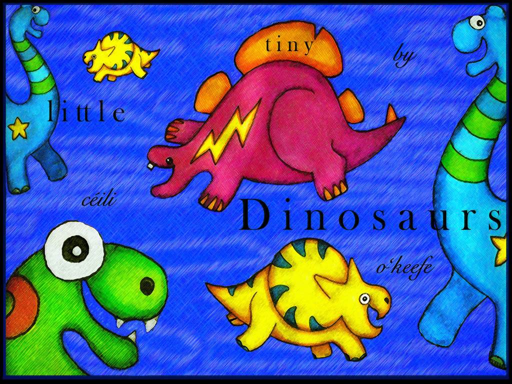
Céili O'Keefe.
These images are less than a third of the also-rans I generated over the course of a few months. But being congenitally resistant to instruction and procedurally myopic made my way the hard way; yours needn't be. DIY is obviously the first choice of the remotely able, if not the only one. Put a leash on The Artist; try to treat it like a cash job, pull back often, be as critical as you would of some other poor shite's work and keep it RFTB.
If you're artistically declined, don't despair; you can still communicate your taste and ideas with something as simple as an unretouched photograph. Hit up filmic acquaintances for their work or go for a stock pic; online libraries are suffocating under the weight of excellent, accessible photography of every description. Get on to Flickr and Tumblr and ask some of the many talented peeps there if they would let you use their images; you'll get some hell no's and demands for the money everyone believes everyone else is making, but you'll also strike plenty who'll be happy to help for next to or literally nothing. Just be honest in your dealings with potential collaborators and know your rights and obligations around licensing and ownership. If you choose to go with a pro, you're possibly doing the smart thing. Sight your conceptual objectives directly. Learn to clearly delineate your ideas and desires to anyone you commission; this alone can be more difficult than you expected. If you can't effectively explain them to your partner or your mother or that hunk behind the counter at the bookshop, you need to try harder because failure can quickly become painful and expensive. Above all, we should have enough respect for our own efforts to at least try and get them the cover they deserve. Keep reminding yourself that it's easier than writing the darn thing in the first place.
Céili O'Keefe.
 RSS Feed