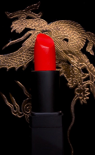
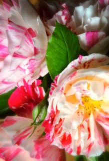
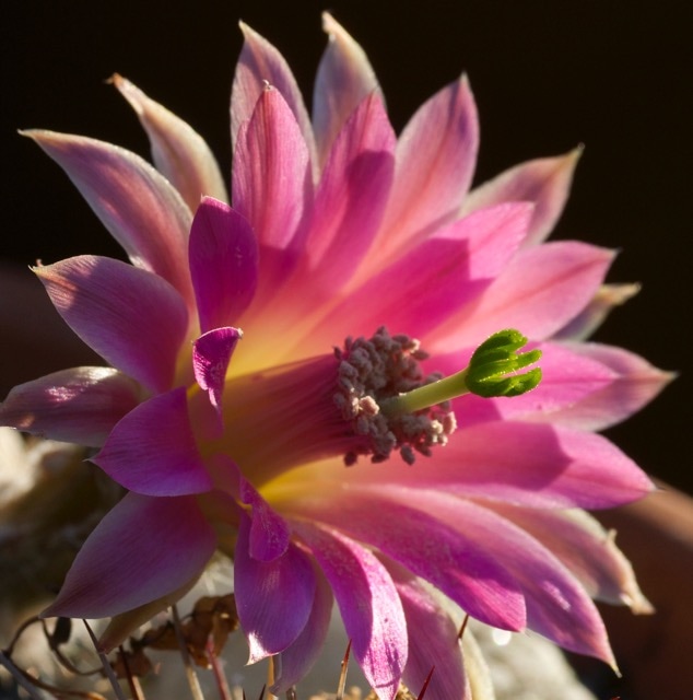
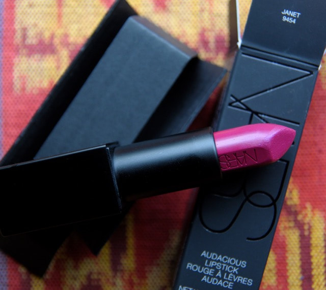
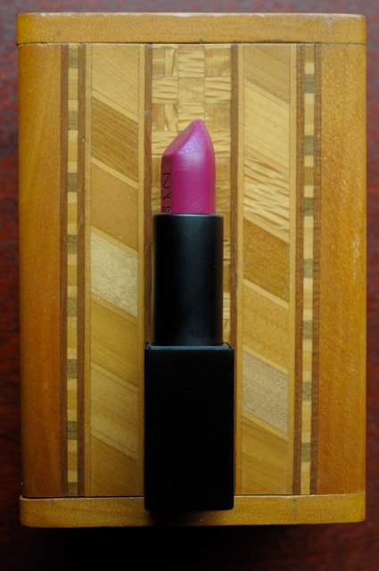
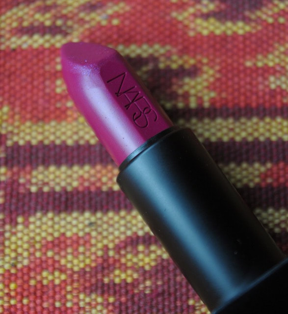
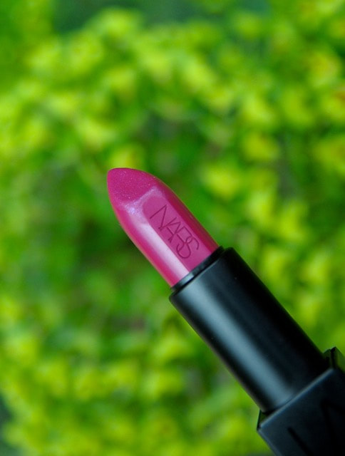
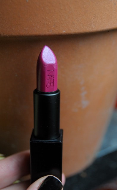
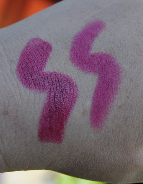
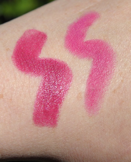
| A big magenta carries the same mana as a classic red; assertive, trend-resistant and cross-seasonal. Few shades are as explicitly beautifying. It embiggens your eye colour and can even make a shitty dye job look better (I should know). Janet is magenta done right; a rich, vivid and joyous embodiment of all those good things. I know what you're thinking. But I already have MAC Show Orchid and that's my pinky blue OG! Is it, though? The various Nars ranges have weaned me off many of my former MAC and UD favourites. I may be aging out of the latters' target demo but I'm also a lot more fucking discerning these days and all those trashy sentimental favourites seem to have lost much of their charm. It comes down to comprehensive quality. On the face, Show Orchid and her slew of UD equivalents look so shrieking, greasy and candied beside Janet. SO is more fuchsia, to be sure, but one is strong and the others are just... loud. I'm reminded of the difference between PJ Harvey and Courtney Love. | I didn't realise just how many iterations of this deep magenta I already owned before buying yet another one. There is no end to my depravity. At this point I should caution that it is ubermeta-awesome on the right face. Just like a bold red, fuchsia-magenta can veer hard into visual nails/chalkboard territory when it's smooshed where it don't belong. The more strident and less balanced the shade, the greater the potential for horror. A blue pearl ups the hazard level even further; MAC Violetta on just about anyone is a perfect example of this gruesome phenomenon. Quality, bitches. Quality. I was fortunate to strike an overcast day to photograph this shade as direct sunlight blows it out of gamut. These pics are pretty accurate, recording the temperature shift away from pink with the change in light. Note the strong blue cast apparent in the bullet shot to the left there. This blue derives almost entirely in the pearl itself which is milled down to the kind of powdery nothingness that eliminates any gritty mouthfeel or impression of glitter, providing a moderate serving of violet duochrome over the true magenta base. It may be hard to imagine, but this is a relatively sophisticated look, rooted in the careful selection of the two adjacent shades- that vital thing other, lesser versions get wrong. |
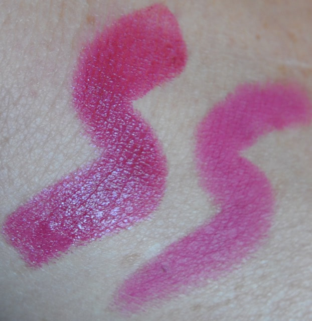
We have Nars Janet (left) and MAC Flat Out Fabulous (Retro Matte) for comparison in the triptych below. Trying to get Janet's blue duochrome to show up without the sensor splitting it into glitter is next to impossible. The pic at far left if probably closest.
Finally, don't succumb to the temptation to pencil a magenta outline, even in the utterly, inconceivably unlikely event your liner matches perfectly. In fact, wipe a fingertip lightly around the edge of your application or do the same with a transparent primer stick to blur it out a wee bit. Extra wearability is achieved just by taking down that margin contrast.
But whatever. I love Nars Janet. She can sit on my face any time.
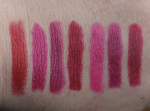
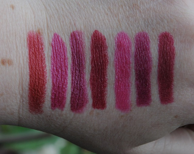
Bite Beauty Beetroot, Girl About Town, Rebel, D for Danger

 RSS Feed
